

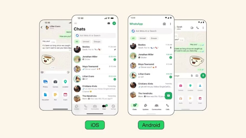

WhatsApp has recently unveiled a fresh new design for its app on both iOS and Android devices. The messaging app has begun rolling out the updated look to users, aiming to provide a more modern and user-friendly experience. What specific changes have been made?
A significant update includes the improvement of dark mode, now featuring a darker background for better text legibility. Conversely, light mode has been revamped with more white space, enhancing the overall appearance and usability.
In terms of color palette, WhatsApp has introduced a new shade of green to align with its brand identity. The use of color has been strategically refined to highlight important elements on the screen, ensuring a more focused user experience.
Icon and button designs have also been revamped, with changes in shape and color for a more visually appealing interface. Additionally, certain parts of the app have been spaced out more generously, improving readability and navigation.
Within the “Chats” tab, users will now see the WhatsApp logo, providing a clear visual indicator. For Android users, navigation tabs that were previously at the top of the screen have been moved to the bottom for easier access.
Another notable change is the relocation of the search bar, now fixed at the top of the “Chats” tab for improved visibility and accessibility when looking for specific conversations or messages.